Bluebeam• 2023–2024
Real-time collaboration, 97% faster
Role
Lead Product Designer
Timeline
4 quarters (Q3 2023 – Q2 2024)
Team
1 Product Designer (me)
1 Product Manager
1 Engineer
Skills
Overview
How do you bring real-time collaboration to the browser?
Studio Sessions was Bluebeam's flagship collaboration feature — used by redacted monthly active users across the AEC industry. But it only worked on desktop. I led design on a cross-functional team to bring it to the web, opening collaboration to anyone, on any device.
What this required.
Product Strategy
Aligning on the "why," defining what's in and out of scope, establishing principles for how we'd work.
Systems Design
Defining the policy layer — what's allowed, what's forbidden, and what happens when things go wrong.
Phased Delivery
Shipping V1→V4 over four quarters, each with a clear theme and tight scope.
Problem
Collaboration required a 2.5GB download.
Revu is Bluebeam's flagship product — 4 million users, embedded in the workflows of hundreds of companies and government agencies worldwide. Studio Sessions, its real-time collaboration feature, had redacted MAUs placing 5 million markups per day.
But Revu was required. And Revu required desktop. For everyone. Building owners, clients, consultants — people who aren't AECO pros — they'd need to download 2.5GB of desktop software just to look at a file. Customers told us they'd rather go back to emailing PDFs — and all the version chaos that comes with it.
The industry had moved on. By 2024, mobile accounted for 62.5% of global web traffic. [2] 91% of construction professionals were using smartphones daily for work. [3]
Revu-only, and desktop-only collaboration was becoming a liability.
Solution
Real-time collaboration, accessible to anyone.
I designed the end-to-end web collaboration experience — document viewing, navigation, real-time presence, avatars, and the flows that tie it all together. One document, one source of truth, everyone looking at the same thing. No more version conflicts. No more "which PDF is current?"
This wasn't about feature parity with Revu. Revu users are expert users — people who live in the product daily. But the people joining via web would be different: building owners, external consultants, subcontractors who just need to see a drawing and leave a comment.
We grounded every decision in this distinction: 20% of the features would deliver 80% of the value for these users. We didn't need to suffocate collaborators with expert tools — we needed to get them in, let them contribute, and get out of their way.
Core Flows
The essential collaboration experiences.
Joining a session
Click an invite link, choose your path, land in the session. No downloads, no friction.
Viewing & navigating documents
Pan, zoom, move between sheets. See who else is here with real-time presence indicators.
Leaving markups
Add comments, callouts, annotations — the core collaboration act. Markups appear in real-time for everyone.
Creating a Session
Start a new Session directly from the browser. Name it, invite collaborators, and begin working together — no desktop app required.
Managing files
Import documents from other locations, download copies, delete files you no longer need. Full file management without leaving the browser.
The Case for Web Collaboration
Why this was the moment to act.
"Just send me a link."
Google Trends relative search interest for “Send me a link” (United States, 2011–2026)
This phrase tells the whole story. From 2011 to 2018, search interest in "send me a link" grew steadily — then accelerated sharply after 2019. [1] Link-based access became the default expectation. Asking someone to download software to view a file started to feel like asking them to fax it.
Hypothesis: Link-based access has become the default user expectation.
Measured by: Time to open — how long from clicking an invite to landing in a session.
Customer demand
71%
Hybrid work adoption
22%
Cite flexibility as key factor
Our research confirmed it: users wanted platform-agnostic collaboration. 71% of U.S. employers had moved to hybrid work models. [5] Construction teams were distributed across offices, jobsites, and home — and 22% of job candidates now cited flexible work arrangements as important to their decisions. [3] They didn't care about our product architecture — they just wanted to work with their people, on whatever device they had.
Hypothesis: Users want platform-agnostic collaboration — they'll go elsewhere if we don't provide it.
Measured by: Feature request volume for web/mobile access; session abandonment rate when Revu isn't installed.
A closing window
Student computing platform trends, 2000–2024
Bluebeam was sunsetting both the iPad app and Revu for Mac. The answer to mobile and Mac was clear: Bluebeam Cloud, the web product. But Cloud didn't connect to Sessions — the feature that made Revu sticky. Without that bridge, Revu users had no reason to touch Cloud, and Cloud users couldn't participate in Sessions.
Meanwhile, the generational math was shifting. Over 24 years, Mac usage among students climbed from under 10% to over 40%, while Windows dropped from 90% to roughly 50%. [9] Nearly half of today's AEC students use Macs — a sea change from a generation ago. The future architects and engineers entering the workforce expect Mac support, because it's what they know. Windows-only wasn't just inconvenient; it was a generational risk.
Hypothesis: Without action, Bluebeam's collaboration story would fragment — or disappear.
Measured by: iPad app MAU decline; Cloud-to-Sessions cross-engagement rate.
Competitors had already moved
Platform support across construction collaboration tools
| Product | Web | Mobile | Desktop | Note |
|---|---|---|---|---|
| Procore | 100% browser-native | |||
| Autodesk Construction Cloud | Cloud-first since 2019 | |||
| PlanGrid | Browser-native from day one | |||
| Fieldwire | Browser-native from day one | |||
| Bluebeam Studio Sessions | Desktop-only (Windows) |
By 2024, 63% of construction software deployments were cloud-based — and growing faster than on-premises alternatives. [4] Procore was 100% browser-native with 1.3 million users. [6] Autodesk acquired PlanGrid for $875M and made it fully browser-accessible. [7] The installed desktop app was becoming the exception, not the rule.
Hypothesis: Browser-native collaboration is now table stakes — desktop-only is a competitive liability.
Measured by: Competitive loss rate citing "ease of access" or "no download required."
The opportunity
Sessions was the feature that made Revu sticky — the reason teams stayed on the platform. Bringing it to the web would give customers the platform-agnostic access they were demanding, replace the dying iPad app, and connect Revu and Cloud through the feature people actually cared about.
Hypothesis: Sessions is the wedge — bringing it to web solves customer demand, replaces the iPad app, and unifies the product suite.
Measured by: Web session participation rate; new Cloud users acquired through Sessions invites.
How We Shipped It
Four phases. Fixed deadlines. Variable scope.
I worked with PM and Engineering to break the project into four phases, shipped quarterly. Each phase had a theme, a clear scope, and explicit "doing / not doing" lists. This kept us honest. When new requests came in, we had a document to point to. No scope creep.
Four quarterly releases, fixed deadlines, variable scope
My stuff follows me
- Join sessions
- Basic markups
General availability
- Join from invite & alert emails
Admin abilities
- Manage attendees and files
File management
- Import, download, delete files
V1 scope definition — explicit "doing / not doing" list
- Access a previously joined Session
- Access a Session that I've been invited to
- Leave a Session
- Navigate list of docs within a Session
- See markups, including markups placed/edited by others in real time
- Place basic markup
- Edit basic markup
- Delete basic markup
- Disallow editing other peoples' markups and locked markups
- Access Session via mobile client
- Initiate a Session via web client
- Join a Session ad-hoc by entering a Session ID
- Access Sessions via invite email
- See the Record via the web client
- Change status via the web client
- Session management via web client (add/remove people + permissions, files, etc.)
- Chat, poke, or send alerts via the web client
- Connect to or download Revu from web Sessions
- Browser attempts to hand the Session off to Revu
Design Decisions
Hard choices, explicit tradeoffs.
Building for web meant making decisions we could defend. Here are a few that shaped the product.
What belongs in the web experience?
This wasn't about rebuilding Revu in a browser. We had to decide what mattered for the users who'd actually be joining via web.
Feature needs by user type
| Feature | ||
|---|---|---|
| Advanced measurementsexpert-only | ||
| Batch processingexpert-only | ||
| Custom tool chestsexpert-only | ||
| 3D PDF supportexpert-only | ||
| Session management | ||
| Document navigation | ||
| Basic markups | ||
| Real-time presence | ||
| View & comment |
20% of features deliver 80% of value for collaborators
Revu users
Power users. General contractors, architects, engineers. They live in the product. They want every tool.
Web users
Collaborators. Building owners, consultants, subcontractors checking in. They need to see a drawing, leave a comment, and move on.
We used the 80/20 rule: 20% of the features would deliver 80% of the value for collaborators. We cut aggressively.
The legacy tech stack reinforced this. Revu and Studio Sessions are built on aging technology — certain features couldn't be ported, and some interactions had to be reimagined rather than replicated. We weren't building Revu in a browser. We were building a focused collaboration tool for a different type of user.
This framing kept us focused. Every feature request got filtered through: "Is this for a collaborator, or an expert?"
The landing page is the front door.
When a user clicks an invite link, what should happen? I explored three approaches:
Auto-route to Revu
Fire the custom URI. If Revu is installed, open it automatically.
Problem: If Revu isn't installed, nothing happens. User is stranded.
Auto-route to Web
Skip Revu entirely. Everyone goes to the browser.
Problem: Alienates the 4M Revu users who prefer the desktop experience.
Give users a choice
Show a landing page with both options.
Tradeoff: Adds one click. But no one gets stranded, and we respect user preference.

Before: Blank page, cryptic text, OS popup

After: Landing page with "Join in Revu" / "Join in Web"

Why choice won: Safari.
When you fire a custom URI like bluebeam://join and the app isn't installed, browsers handle it differently. Chrome fails silently — nothing happens. Safari shows an error. Neither is great, but Safari's error was worse: it looked like something broke.
Safari accounts for roughly 1 billion users globally, including over half of U.S. mobile traffic. [8] We couldn't auto-fire and hope for the best.
Every entry point is a promise.
Users don't enter sessions from one place. They come from invite emails, alert notifications ("Sarah commented on your markup"), direct links, and 9-digit session codes — something you could read over the phone or write on a whiteboard. (Code entry existed in Revu; we descoped it for web V1.)
Multiple entry points, one destination
Invite email
You'll land in this session
Alert email
You'll land on this markup
Direct link
This URL will get you there
Session code
Type this and you're in
Studio Session
on Web
Each entry point carries a different promise:
- Invite email: "You'll land in this session."
- Alert email: "You'll land on this specific markup."
- Direct link: "This URL will get you there."
- Session code: "Type this and you're in." (descoped for this initiative)
Breaking that promise breaks trust. If someone clicks an alert about a markup and lands on the session homepage instead of the markup itself — that's a failure, even if they're technically "in."
The design challenge: the web doesn't preserve context well. Redirects lose state. Browser handoffs drop parameters. App switching is unpredictable. I mapped every entry-to-destination path and designed a system that honors the original intent, regardless of how chaotic the journey gets.
The URL isn't just an address — it's carrying payload: intent, destination, and permissions context. Lose any of it, and you've broken the promise.
Presence enables collaboration — but too much presence kills focus.
In Figma, cursors show where people are working — it's a workspace. You're creating together. Cursor movement is signal: "I'm iterating on this component," "I'm exploring over here."
Sessions is different. The document is a source of truth representing something physical being built. You're not creating together — you're reviewing, annotating, and deciding together. The question isn't "where are they designing?" It's "what are they looking at?" and "do they agree?"
Cursors answer "what are they looking at?" Markups answer "do they agree?" We stream both in real-time — attention and judgment, unfolding together.
But Sessions isn't collaborative design. It's design review — a formal process where stakeholders inspect documents and commit decisions to the record. A markup isn't a suggestion to riff on. It's "this dimension is wrong" or "verify in the field." When you see a cursor hover, then a markup take shape stroke-by-stroke, you're not watching someone brainstorm. You're watching a decision get made.
Why real-time? Because even formal processes have conversation. You see a colleague flag something — and you can weigh in before it's final. You avoid duplicating observations. Questions get resolved in the moment, not in follow-up email chains. The review is formal. Real-time makes it faster.
Policy before pixels.
Before designing any UI, I defined the policy layer: what's allowed, what's forbidden, and what happens when things go wrong.
Policy decision tree — "Can this user join this Session?"
What's allowed?
Who can join? Who can invite others? Who can remove attendees? Who can add files?
What's forbidden?
Can you join a session you've been removed from? Can you import files larger than X? Can two people edit the same markup simultaneously?
What happens on failure?
Session ends while you're active — what do you see? File import fails — what's the message? You lose connection — do we auto-reconnect?
Defining these rules first meant the UI had a job to do: communicate the policy, not invent it. This prevented weeks of "wait, what should happen here?" debates during implementation.
Graceful degradation: designing for when things go wrong.
At scale, edge cases aren't edge cases — they're daily occurrences. With redacted MAUs and redacted million markups per day, every "unlikely" scenario becomes someone's Tuesday.
I designed flows and UI for dozens of failure states — what the user sees, what they can do next, how we communicate what happened.
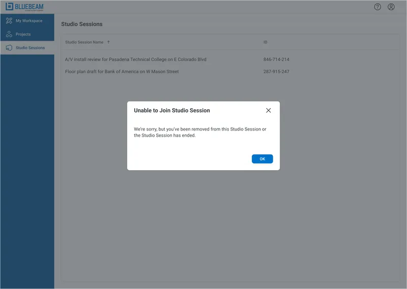
User removed mid-session
Someone kicks you out while you're working. You see a clear message and a path forward — not an app crash.
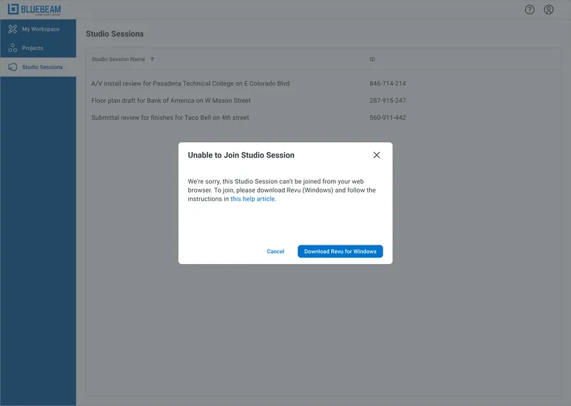
Session exceeds size threshold
Some sessions are too large for the web client. We catch this before you join if possible, and gracefully exit if it happens mid-session.
Other scenarios
Session ends while you're active
The host ends the session. We tell you what happened and offer to save your work.
Permission errors
You don't have access. We tell you why and what you can do about it — contact the host, request access, or try a different account.
The principle: never leave users stranded. Every dead-end needs an exit sign.
Outcome
Shipped on time. Metrics exceeded.
4/4
Phases delivered on schedule
97%
Reduction in time-to-open
All four phases delivered on schedule across four quarters. Time-to-open dropped 97% — from downloading a 2.5GB app to clicking a link.
In the Wild
Press, accolades, and official media.
Press coverage
Official sizzle reel
Try It Yourself
Experience real-time collaboration
Click anywhere on the canvas below to place pins. If other visitors are on this page, you'll see their cursors and markups in real-time. Ghost collaborators will join when the room is quiet.
Reflection
What I learned
Constraints are decisions you don't have to make.
The legacy tech stack meant we couldn't port everything. Good. It forced clarity. Instead of debating which features to include, we asked: "What can we actually build?" Constraint killed scope creep before it started.
Your non-users might be your most important users.
Revu power users weren't the audience. The building owner who gets one invite per quarter was. Designing for the person who doesn't know your product — and never will — changes everything.
Don't borrow patterns. Borrow principles.
Figma's real-time cursors are iconic. But Figma is a workspace; Sessions is a courtroom record. Same pattern, different meaning. Understanding why something works elsewhere is the only way to know if it'll work here.
Sources
[1] "Send me a link" search interest: Google Trends, 2011–2026 ↩
[2] Mobile web traffic (62.5%): Mobiloud, 2024 ↩
[3] Construction smartphone usage, job candidate preferences: AGC/Sage Construction Hiring and Business Outlook, 2023-2024 ↩
[4] Cloud deployment in construction (63%): Mordor Intelligence Construction Management Software Market Report, 2024 ↩
[5] Hybrid work adoption (71%): Projectmark, 2024 ↩
[6] Procore users (1.3M): Procore S-1 Filing, SEC ↩
[7] PlanGrid acquisition ($875M): Autodesk Construction Cloud ↩
[8] Safari market share: DemandSage, Backlinko, 2024 ↩
[9] Student computer preferences (Mac <10% to 40%+, Windows 90% to ~50%): Jamf, 24-year trend analysis ↩